San Anselmo House
“Tearing down was not an option for me. That messaging would be all wrong given my baseline design philosophies and environmental values. The amount of waste involved in tearing it down is exactly what I aim to avoid when improving a property for, whether for me or for clients.
Investing in good materials and thoughtful design should inspire maintenance. Living amidst the most consumptive and wasteful society in human history, a society with a misguided drive for constant ‘newness’, is something I work to reverse for those I come in contact with.
Good materials, handled correctly, improve with age and care. Embracing, upgrading and inspiring others to think similarly was the only option.”
This personal project required me looking at multiple properties a week for over two years to find something I could work with. It had to be in an area where we specifically wanted to live and not involve paying for someone else’s renovation. I wanted raw, a property ready for a thorough remodel.
This was the ticket. Built in 1946 during the Marin home construction boom that followed the completion of the Golden Gate Bridge, it got a major addition in ‘55, including a swimming pool, and very little attention after that.
California Challenges
These were not particularly well built homes like the ones I am accustomed to having grown up in old New England towns. It’s highly likely that it would have been less expensive to have torn it down and built anew due to the current code requirements.
Retrofitting a crudely built sled-on-clay to meet the current seismic codes and CA energy requirements is definitely challenging and costly. I describe it as ‘sled-on-clay’ because there was no foundation to speak of, only very shallow concrete spread-footings on a hilly site, non-reinforced concrete.
Caught Between Two Epochs
Fascinating to me is the fact that in 1946, builders of new homes in the area were looking backward in time and toward southern Europe.
This was probably due to the many Italian immigrant families in the Bay Area attempting to recreate the Mediterranean lifestyle of their ancestral homes.
And then by 1955, less than a decade later, the entire country seemed to be looking forward to a more technologically bright future, dawn of the Space Age. This simple house expressed all of that to me albeit in quiet ways and perhaps lacking full self-awareness.
A Conflicted Identity
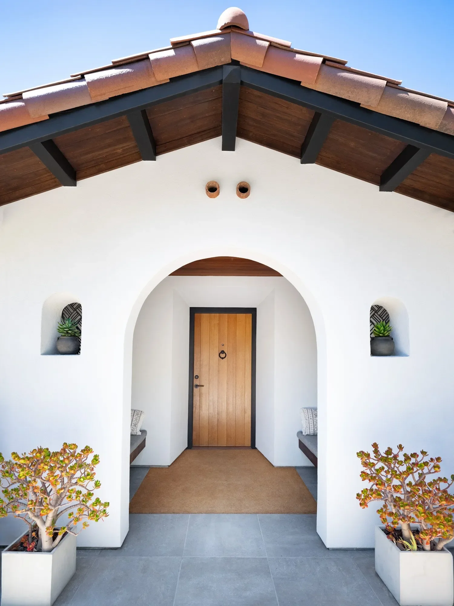
The front and original part of the house revealed a half-assed attempt to incorporate some crafty Spanish Revival elements popular in a neighborhood a few blocks away developed in the prior decade.
The large addition at the back of the house was clearly inspired by something entirely different with its flat roof and deep cantilevered overhangs. Unwilling to deny this quirky history, I clearly accentuated it.

We’re obsessed with getting the proportions right.
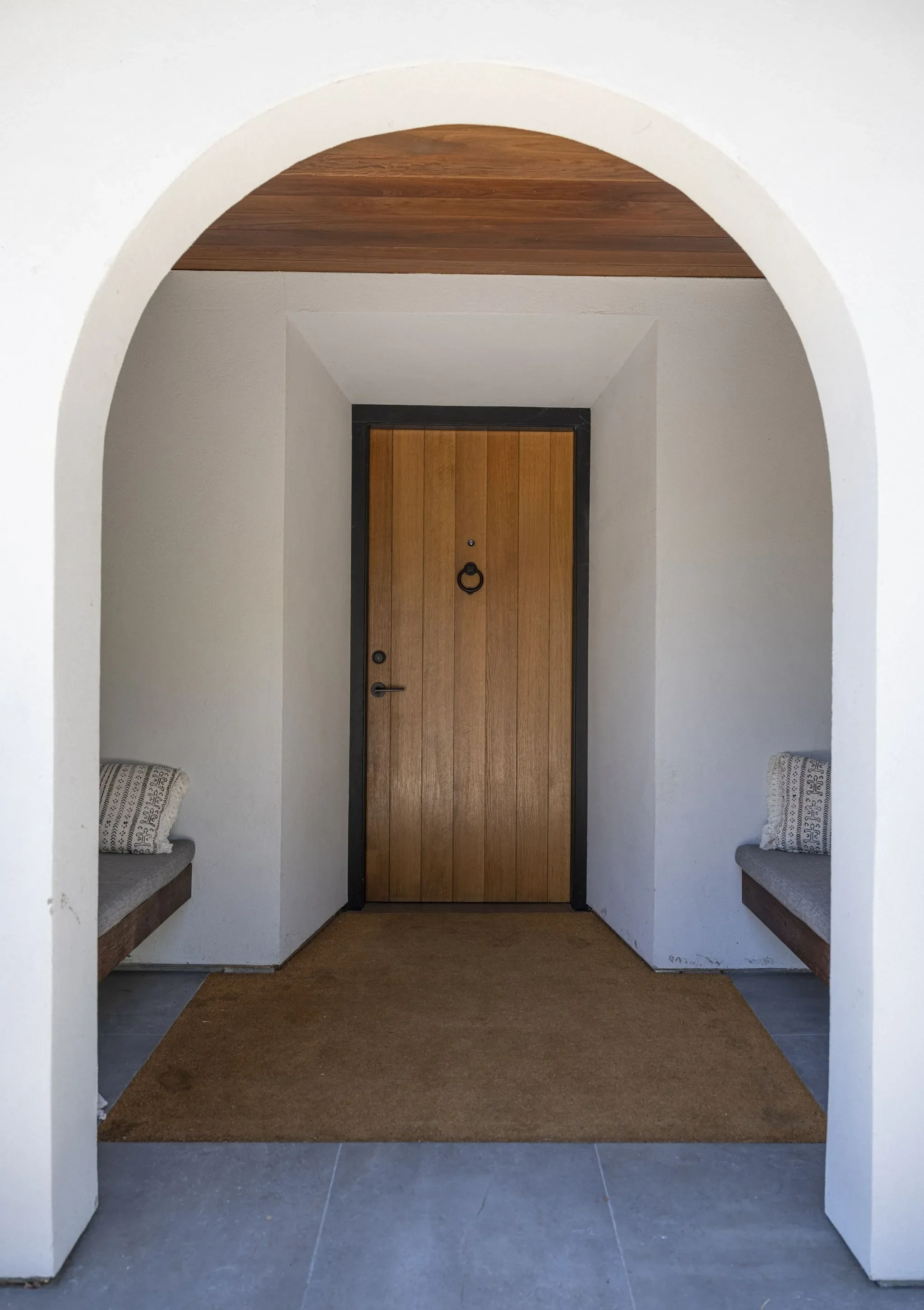
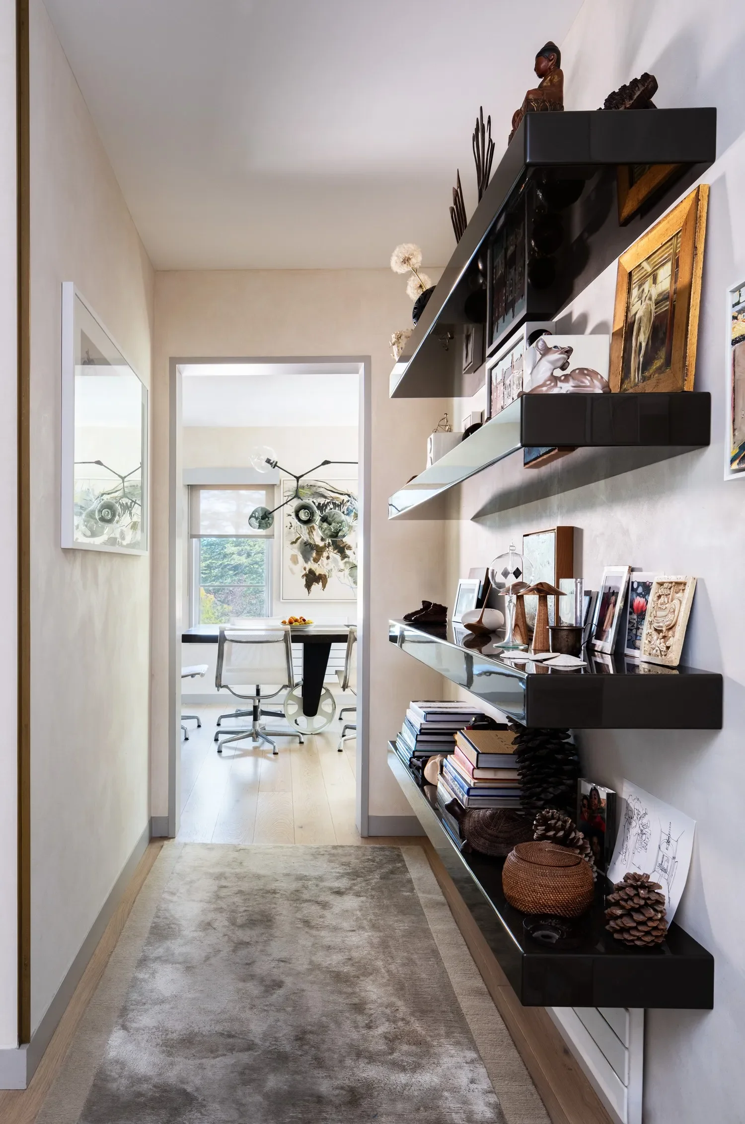
In pursuit of flawless space planning at the outset, we’ll nudge any wall, sometimes only by inches, to achieve our goals, as was the case in this Foyer.
The exterior Portico was reduced enough in size to accommodate Foyer coat closets deep enough to be useful, stairs to the lower level wide enough to be code compliant and passageway wide enough to accommodate shelves to display our various collections.
Kitchen & Dining Area
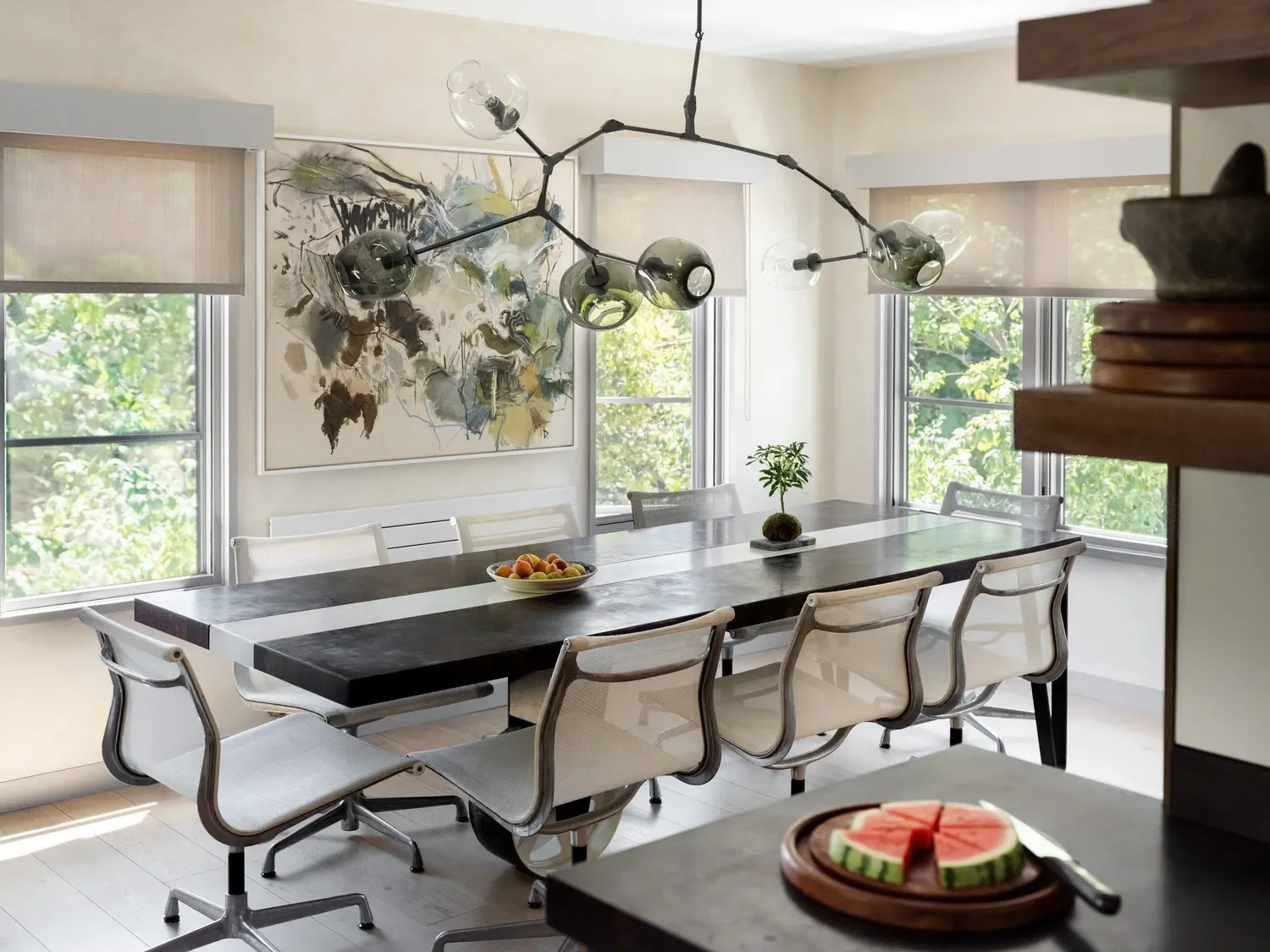
Almost every cabinet, appliance and piece of furniture in this kitchen & dining area was removed from our small NYC apartment when we sold to a neighbor seeking additional bedrooms for a growing family.
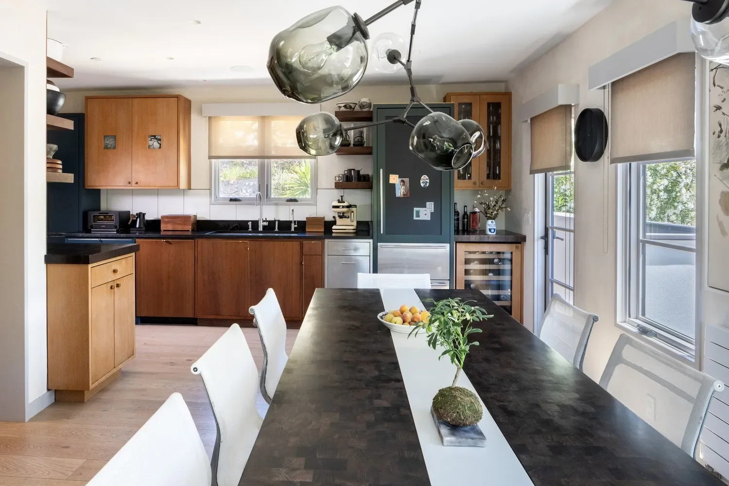
Our past investment in quality custom goods & appliances definitely warranted their cross-country transport and creative re-use in a very different setting. Only a couple additional new custom cabinets were needed to fill the gaps in a somewhat larger suburban kitchen.
Creative re-use is absolutely essential for the health of the planet and makes extremely good sense from an investment perspective.
Invest in quality. Invest in beautiful things that you’ll treasure and maintain forever. Deny the mainstream lust for newness.
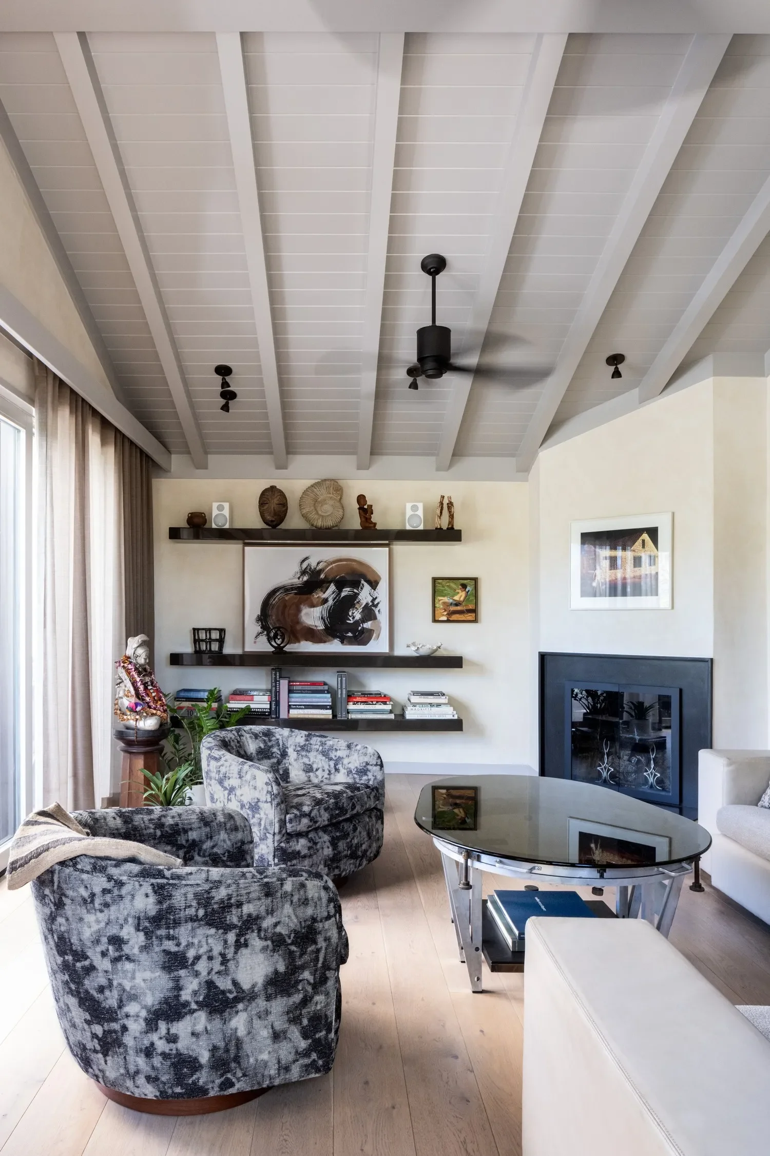
Vaulting the ceiling in the living room and where I could in other rooms in the older section of the house accentuates the distinction between the gable-roof of the original house and flat roof of the addition.
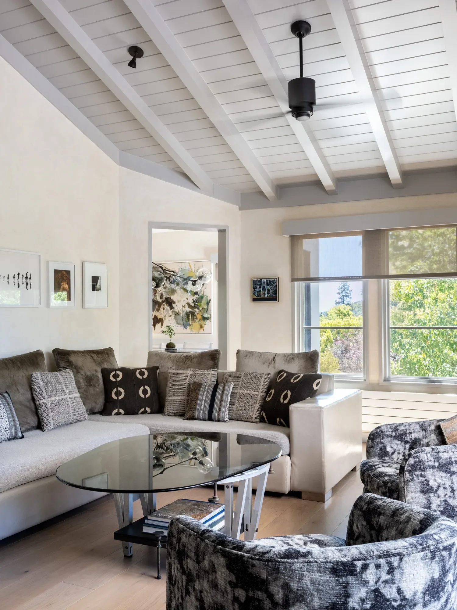
Applying the same clay to most all wall surfaces throughout definitely unifies. Making handwork very apparent on most walls is a nod of appreciation to all of the handcraft in our local Spanish Revival home. It’s “Neo-adobe” in concept.
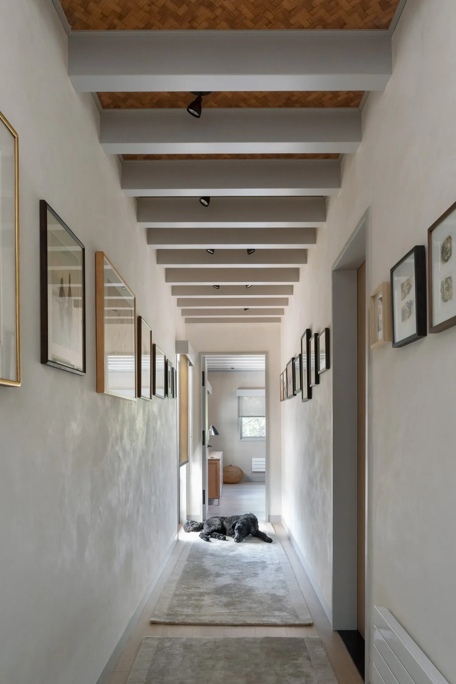
The different ceiling types celebrate divergent histories. A hinge point in California residential architecture is on display.
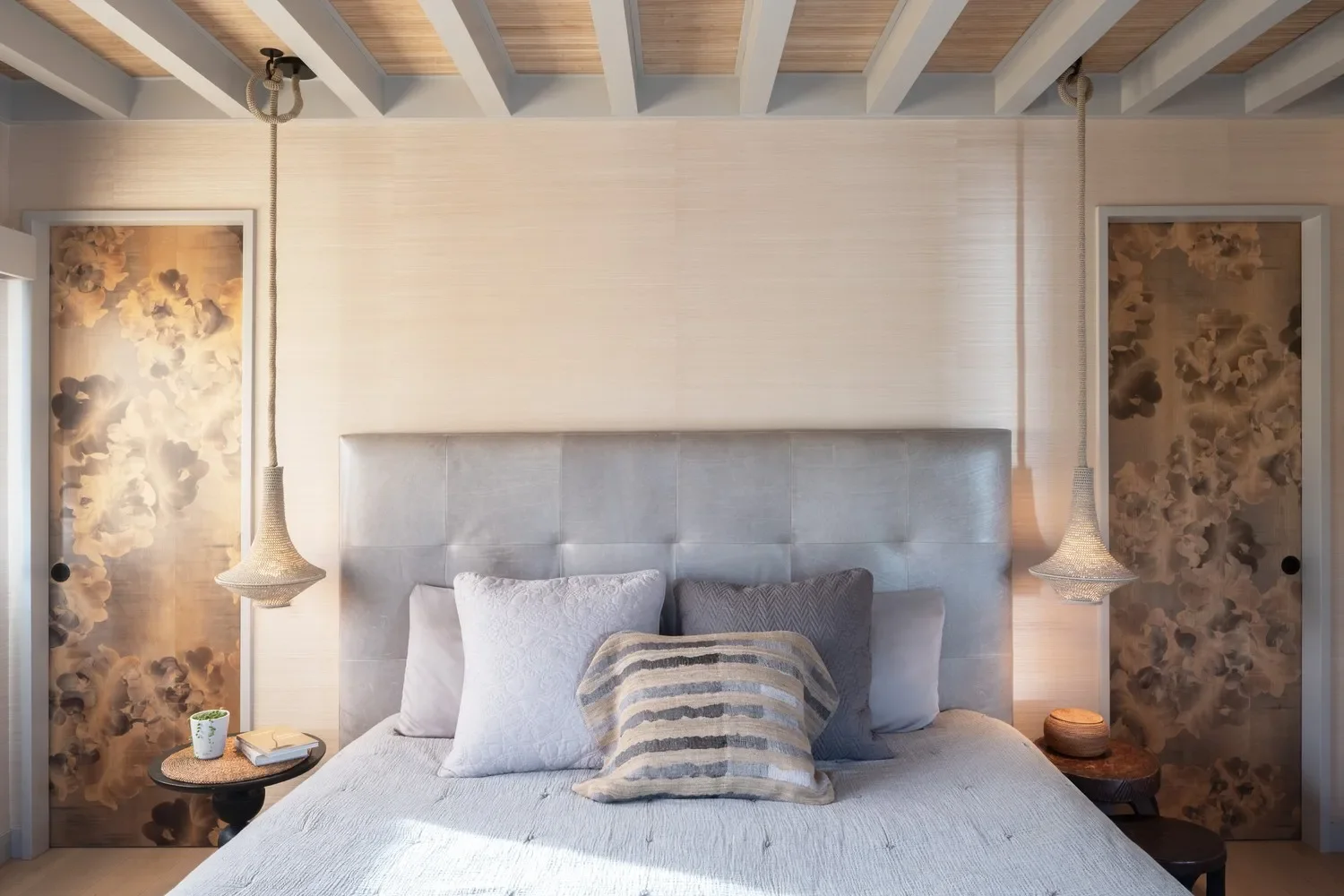
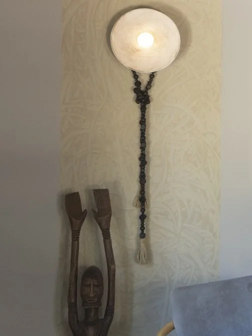
The only non-clay walls are the earthy grasscloth in the primary bedroom and abstract watercolor wallpaper in the hallway bathroom. The grasscloth is accompanied by a pair of crochet pendants, bamboo panels between beams and rare doors clad in exquisite veneers onto which abstract floral photographs have been directly transferred.
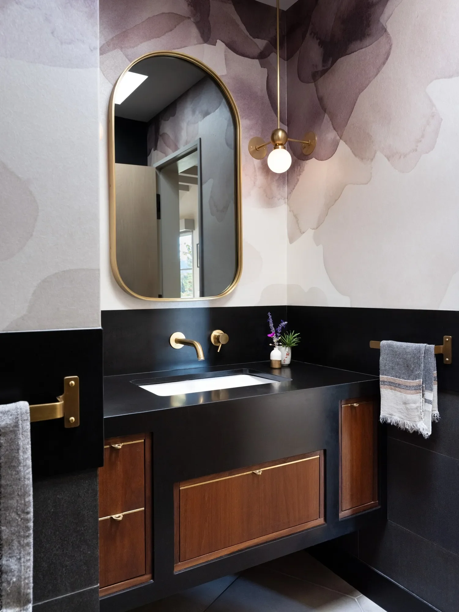
That brass mirror frame, brass pendant and brass cabinet hardware were all custom-fabricated for the hallway bathroom.
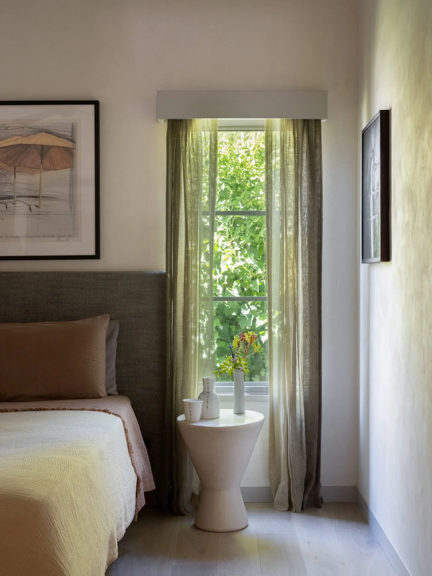
The subtlety of hand-painted ombré sheers together with clay walls, muted colors of the bedding and simple form of the tadelakt bedside table is exemplary of the consistently understated and carefully assembled compositions repeated throughout the house.
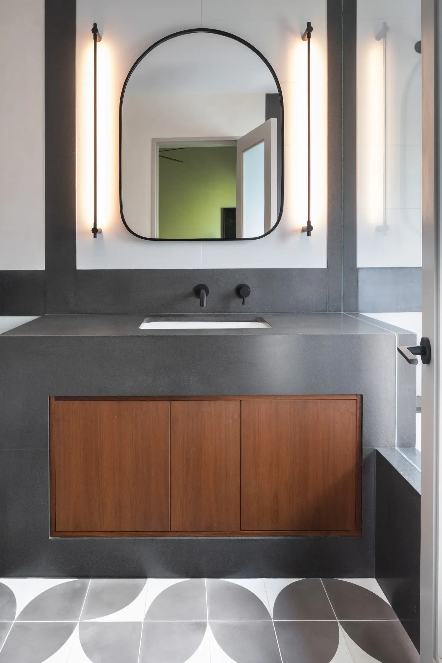
In this bathroom, a cold gray monolithic vanity is warmed by inset walnut doors. The curvilinear mirror and floor tile graphic counterbalance an abundance of straight lines.
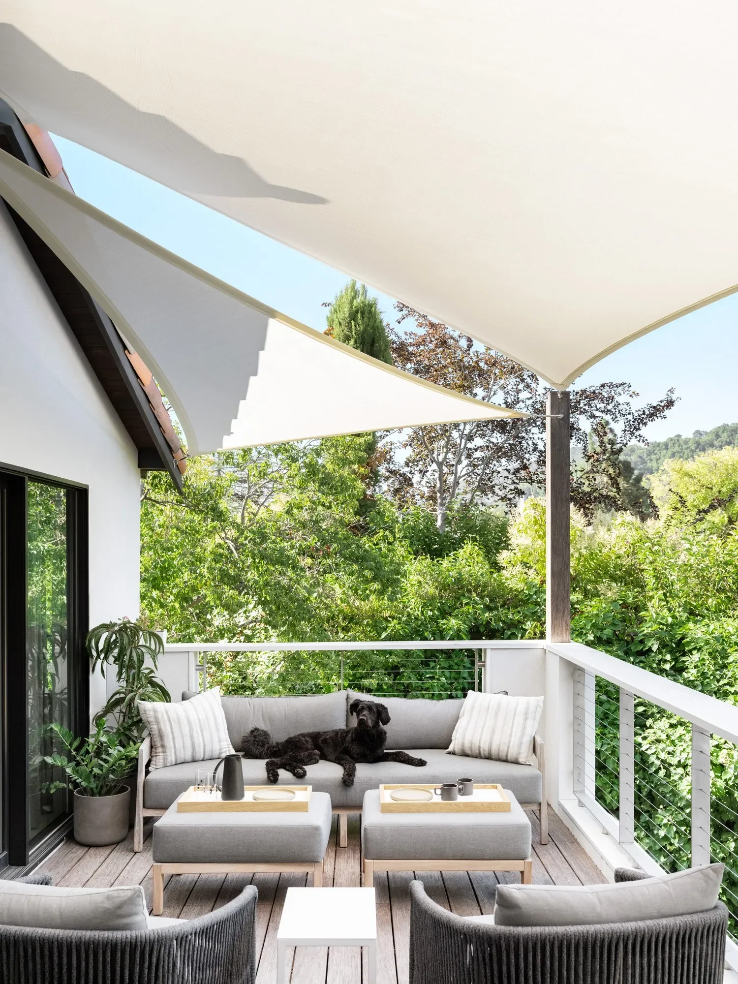
There’s that incredibly adorable schnoodle again, a living, breathing accessory extraordinaire.
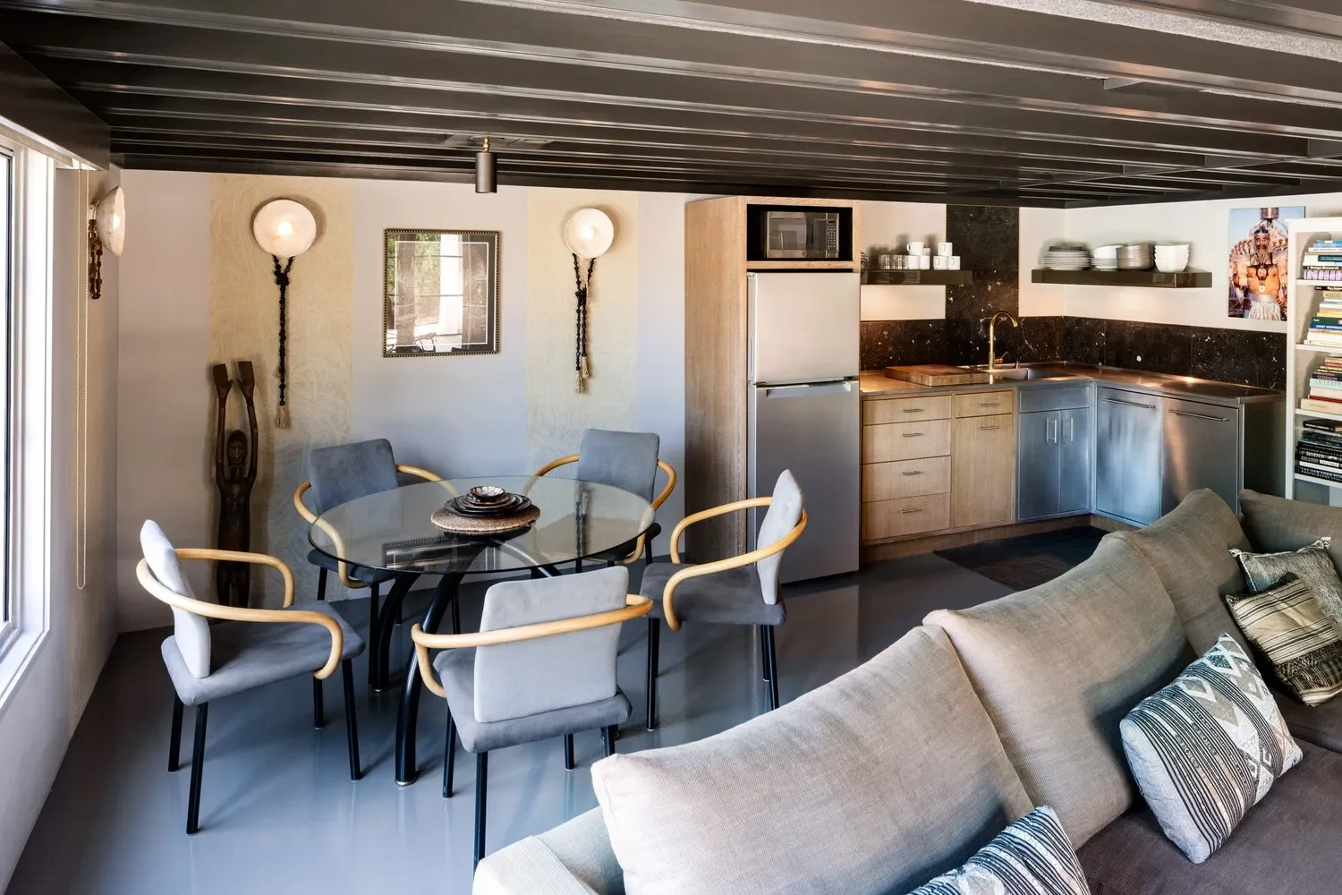
The 1955 sizable addition on a gently sloping site provided a second story, a separate living quarters hidden from street view. While perhaps lacking in ceiling height, it’s a spacious poolside retreat for guests complete with kitchenette. There’s a floor-to-ceiling band of Black Rock Desert clay applied to the walls behind each sconce. The Ettore Sottsass Spyder table and Mandarin chairs were a gift to myself when parting ways with Knoll International at the age of 27.
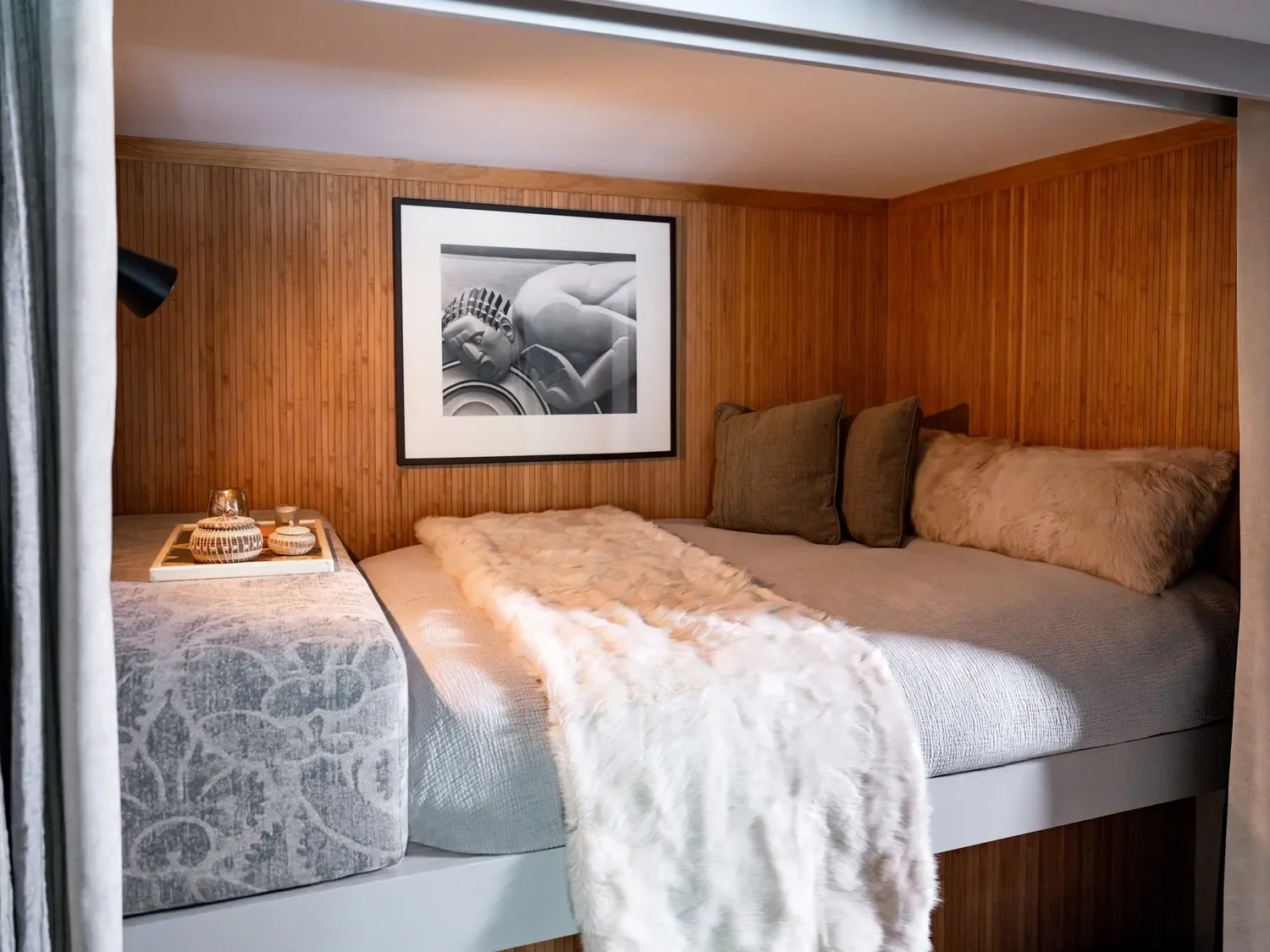
With two bamboo-paneled sleeping areas, this one resembles a couchette and might be the coziest napping nook on the property.
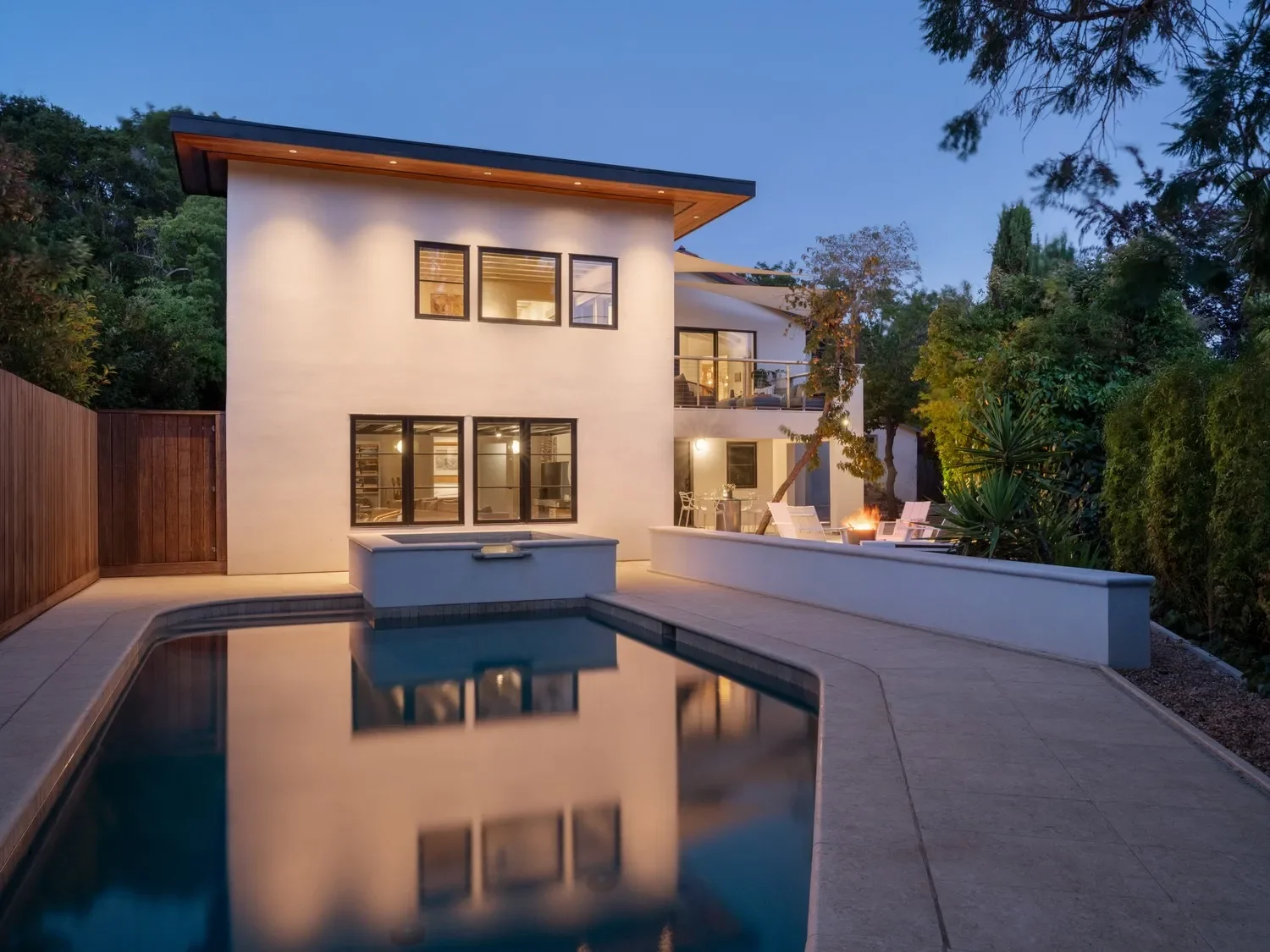
There’s definitely a split personality on display here if one could see both the front and rear of the house simultaneously.
Yet, it all definitely flows.
It’s not ‘one note’ nor dogmatic.
It’s joyfully human and therefore one-of-kind and complex.
If you’re curious to see what we started with, download this PDF photo essay (38 MB).
Get In Touch
If you're interested in working with us, fill out our project info form.